
Design Entrance Exam preparation requires a strong understanding of fundamental design principles, and one of the most crucial aspects is color theory. Whether it is NID, NIFT, or UCEED, color plays a significant role in design thinking, aesthetics, and communication. A well-developed sense of color enhances the ability to create visually appealing compositions, convey emotions, and establish brand identity.
Aspiring designers appearing for the Design Entrance Exam must grasp the principles of color psychology, color combinations, and their practical applications in various fields of design, such as graphic design, fashion, product design, and interior design. This blog explores the significance of color theory and how mastering it can improve performance in the Design Entrance Exam.
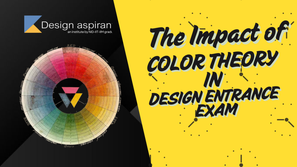
Understanding Color Theory for Design Exams
Color theory refers to the study of colors, their relationships, and their psychological effects. It helps designers understand how different colors interact, evoke emotions, and influence perceptions.
1. The Color Wheel
The color wheel consists of primary, secondary, and tertiary colors:
- Primary Colors: Red, Blue, Yellow (cannot be created by mixing other colors)
- Secondary Colors: Green, Orange, Purple (formed by mixing primary colors)
- Tertiary Colors: A mix of primary and secondary colors (e.g., Red-Orange, Yellow-Green)
2. Color Harmonies and Combinations
For the Design Entrance Exam, understanding color harmony is essential for creating visually appealing designs. Key color combinations include:
- Complementary Colors: Opposite on the color wheel (e.g., Blue & Orange) create high contrast
- Analogous Colors: Next to each other on the color wheel (e.g., Yellow, Yellow-Orange, and Orange) create harmony
- Monochromatic Colors: Variations of the same color with different tints and shades
- Triadic Colors: Three colors evenly spaced on the color wheel (e.g., Red, Blue, Yellow) for a vibrant design
3. The Psychology of Colors
Colors evoke emotions and influence mood, making them a key factor in Design Entrance Exam evaluations. Here are some common interpretations:
- Red – Energy, passion, urgency
- Blue – Trust, calm, stability
- Yellow – Optimism, creativity, warmth
- Green – Nature, harmony, balance
- Purple – Luxury, imagination, royalty
- Black & White – Elegance, simplicity, and contrast
A strong command of color psychology can help candidates make better design choices in their entrance exams.
Why Color Theory Matters in Design Entrance Exams
1. Application in Design Assignments
Many Design Entrance Exam tasks involve creating posters, logos, or illustrations. Applying the right colors enhances the visual impact of designs.
2. Enhancing Portfolio Presentation
A well-curated design portfolio showcasing excellent use of color combinations can leave a lasting impression on evaluators.
3. Effective Communication Through Design
Design is a visual language, and color theory helps communicate messages effectively. Whether it is branding, fashion, or interior design, the right colors can make a significant difference.
4. Developing Creativity and Aesthetic Sense
Mastering color theory enhances creativity and refines the ability to create balanced, appealing compositions.
How to Prepare for Color Theory in Design Entrance Exams
1. Study Famous Color-Themed Designs
Analyzing how top designers use colors in branding, advertisements, fashion, and art can provide valuable insights.
2. Practice Color Schemes in Sketching
Regularly experimenting with different color schemes in sketchbooks and digital designs can improve understanding.
3. Solve Previous Year Papers and Mock Tests
Many Design Entrance Exam questions involve color-based problem-solving. Practicing mock tests improves analytical thinking and application.
4. Experiment with Digital Design Software
Using software such as Adobe Illustrator, Photoshop, or Procreate helps students refine their color application skills in digital formats.
5. Learn About Cultural Associations of Colors
Color meanings vary across cultures. Understanding these associations can help in exams requiring global design awareness.
Common Challenges in Color Theory for Design Exams
1. Understanding Color Interactions
Many students struggle with predicting how colors will interact in different compositions. Studying real-life examples and experimenting with paint or digital tools can improve this skill.
2. Choosing the Right Color Scheme
Selecting the right color palette can be overwhelming. Practicing with limited color palettes and understanding color harmonies can make this easier.
3. Time Constraints in Exam Scenarios
Some students take too long to decide on color combinations during the exam. Practicing under timed conditions can improve efficiency.
Conclusion
Color theory is an essential skill for any design aspirant preparing for the Design Entrance Exam. Understanding color psychology, harmonies, and combinations helps in creating visually appealing and meaningful designs. Whether working on sketches, designing a product, or conceptualizing a branding project, the effective use of color enhances creative output.
To succeed in the Design Entrance Exam, aspirants should:
- Learn color harmonies and psychology to apply in their sketches
- Solve mock tests and practice color-based design questions
- Build a strong portfolio showcasing color expertise
- Stay updated on trends in color application across various design disciplines
By integrating color theory into Design Entrance Exam preparation, students can develop a deeper understanding of visual communication and improve their ability to create compelling design solutions.